The Overview Dashboard
The Overview Dashboard is your control tower for Helm: one glance should tell you how busy your warehouse is, what has just arrived, and whether you are on track to hit your targets

Reading the Room: Understanding the Overview Dashboard
The Overview Dashboard is the Helm command balcony: one glance should tell you how today is going, what has just landed, which levers you can pull to chase down more detail, and whether you are on track to hit your targets

Greeting, Date and “What’s New?”
At the very top of the Overview Dashboard, Helm quietly sets the scene for you
This header area serves a few simple but important purposes:
It tells you where you are in the system, with breadcrumbs such as “Overview Dashboard”, “Orders”
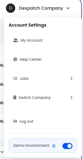
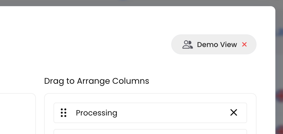
If you are using Demo Data, it will clearly show “Demo Environment” at the top of the screen. Everything you do in Demo Environment stays there; your real account and data remain completely untouched
We have populated Demo Environment with realistic sample data to give you a genuinely hands‑on experience. You can safely explore all features – create orders, manage inventory, and test integrations with no risk at all
A blue border around your screen is your visual cue that you are in Demo Environment. You can return to your live account at any time via the account menu in the top‑right corner
From this header you can also access your account details, and you can be confident that you are looking at today’s data rather than some ancient relic
Finally, the “What’s New?” link gives you a direct path into release notes and product updates, so you can see what has changed in Helm without ever leaving your workspace
Think of this as the dashboard’s prologue: it quietly sets the time, place and version before you plunge into the numbers
Enabling the Demo Environment
In the Demo Environment, we have the luxury of fully populated example data, so let us use that to decode what you are seeing and how to interpret it intelligently
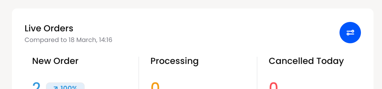
Live Orders: What Is Happening Right Now?
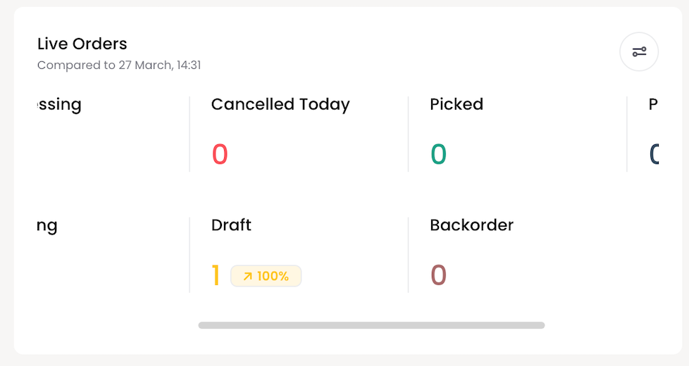
The Live Orders panel shows the current state of today’s order flow and compares it to a previous point in time, for example: “Compared to 12 March, 10:27”
To the right of Live Orders you will see a button. Click this to open a popup window where you can add or remove any columns of interest, and drag and drop them into the order you would like to view them, prioritising whichever is most important to you
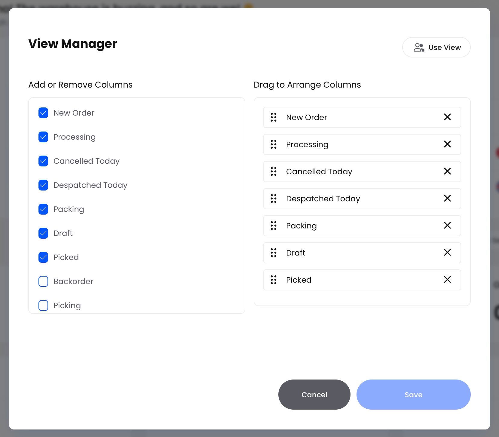
If you want to save your changes click on Use View in the top right corner
Choose your name and click on apply
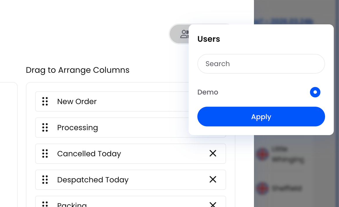
Make the changes you require and then your dash will always show you whats important to you. Everyone can customise their own dashboards.
Once you have customised what you would like to see you can then enjoy your view and watch the numbers work their magic. The better you understand the numbers the more control you have over what is happening and what changes you can make to improve or figure out where the bottlenecks are.
Live Orders Panel Details
Scroll right for more options
Inside this panel, each line represents a stage in your order lifecycle:
New Order – Orders that have been created but not yet processed. The count shows how many, and the percentage shows how this compares to the previous period
Despatched Today – Orders that have been fully shipped out today
Processing – Orders that are being worked on but are not ready to pack or ship yet
Packing – Orders currently in the packing stage (e.g. in totes, on benches, or being consolidated)
Cancelled Today – Orders that have been cancelled on this date
Draft – Orders saved as drafts but not yet confirmed, often used for work in progress or manual creation
Backorder - Orders you have accepted but cannot currently fulfil because stock is unavailable. These will despatch once the required items are back in stock
If you see zeros across most lines, it simply means there has been no activity yet today. As orders move through your processes, you will see the counts change in real time

Live Orders: Today’s Work in Motion
The Live Orders panel is your heartbeat monitor for the current day. In the Demo data, it reads:
New Order: 16 (100%)
Despatched Today: 0
Processing: 6 (100%)
Packing: 0
Cancelled Today: 0
Draft: 8 (100%)
Compared to: 10 March, 14:36
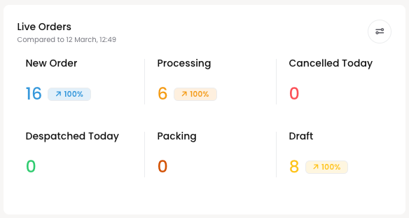
Here is how to interpret this in practical terms:
New Order – 16 (100%)
Sixteen orders have been created so far today. The 100% indicator means that, compared to the reference point (12 March, 12:49), this is a full increase – in other words, activity is up. In a real environment, you would quickly see whether order intake is higher or lower than your usual pattern
Processing – 6 (100%)
Six orders have already moved beyond “New” and are actively being worked on. This is the “the team is on it” metric: it tells you how much work is currently somewhere on the warehouse floor
Draft – 8 (100%)
Eight draft orders suggest your team is using drafts for quotes, telephone orders or partial entries. A high draft count is not necessarily a problem, but if drafts accumulate while New Orders stay low, it may indicate orders are being parked rather than confirmed
Despatched Today, Packing, Cancelled Today
The absence of despatch and packing here is the interesting story: orders are coming in and starting to process, but none have yet crossed the finishing line. On a real site, this would prompt you to ask, “Is it simply early in the day, or is something slowing down the final stages?”
The comparison line “Compared to 12 March, 12:49” is your temporal anchor. If you know 12 March was a typical Tuesday, you can immediately judge whether today’s 16 new orders means “pleasantly busy” or “eerily quiet”
Recently Added: The Latest Orders at a Glance
On the right of Live Orders, the Recently Added section shows the most recent orders created in the system
Each entry typically includes:
An order identifier (which may appear as a long reference or order number)
The number of items on the order
The order value in your base currency (e.g. “£30”)
The customer or destination name (e.g. “Receiving Department”, “Plymouth”, “Newcastle”)
How long ago the order was added (e.g. “17 days ago”)
Use this area when you want to quickly confirm that new orders are being received, or to jump straight into the latest activity without going through the full Orders menu

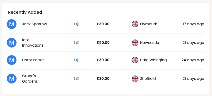
Recently Added: Who Has Just Ordered What?
Beneath Live Orders, the Recently Added section turns abstract metrics into recognisable customers:
Jack Sparrow – £30.00 – Plymouth – 15 days ago
Ian’s Innovations – £50.00 – Newcastle – 19 days ago
Harry Potter – £30.00 – Little Whinging – 22 days ago
Grace’s Gardens – £30.00 – Sheffield – 19 days ago
This is a rolling list of the latest orders, designed for quick sanity checks:
You can confirm that a particular customer’s order has actually arrived in Helm (“Yes, Jack Sparrow is there, £30, shipping to Plymouth”)
You can see the recency of genuine activity – if your most recent order was “90 days ago”, you know you have a different problem entirely
While the Demo names are whimsical, in a live environment you would use this panel as a rapid “audit log at a glance” before diving into the full Orders screen
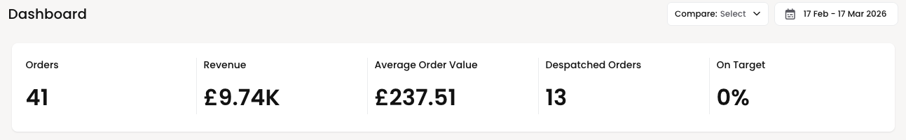
Dashboard Metrics: Performance Over Time
The Dashboard section lets you compare performance over a selected date range. For example, you might see:
“Compare: 13 Feb – 13 Mar 2026” change this date for the dates you want to compare
Within that range, the key metrics are:
Orders – Total number of orders created in the period
Revenue – Total value of those orders
Average Order Value – Revenue divided by the number of orders
Despatched Orders – How many orders were shipped within the period
On Target – A percentage showing how you are performing against your configured targets

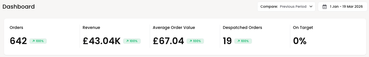
Dashboard Metrics: Orders, Revenue and Targets
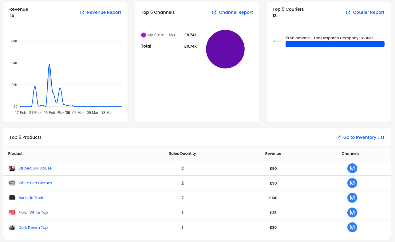
The central Dashboard section gives you a slightly longer lens, focused on a selectable date range. In the Demo environment, the chosen period is:
> 17 Feb – 17 Mar 2026
For that range, the key metrics are:
Orders: 41
Forty‑one orders were created in this period. This helps you assess volume over time rather than just for today
Revenue: £9.74K
The total value of those orders. Combined with Orders, this tells you whether you are making more money because you have more orders, or because the orders you do have are larger
Average Order Value: £237.51
This is the average revenue per order (total revenue divided by order count). In this Demo, 41 orders producing £9.74K yields an average of just over £237. This is very useful when monitoring the impact of promotions and price changes
Despatched Orders: 13
Only thirteen of the orders in the period have actually been despatched. This distinction between “created” and “completed” is crucial; a healthy operation wants a good proportion of created orders to reach despatch, not loiter eternally in Processing
On Target: 0%
In this Demo, On Target shows 0%. That does not mean your business is failing; it means you have not yet configured performance targets for this environment. Once targets are set, this percentage becomes a tidy visual cue of how close you are to your goals for orders or revenue
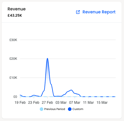
Revenue graph
Below these headline figures, you will see a line chart stepping across the date range, with values such as £6K, £4K, £2K and data points along dates like 17 Feb, 21 Feb, 25 Feb, into March. A spike around £1.29K on one date suggests a particularly busy day. This graph is your “pattern detector” – are you seeing regular peaks on certain days of the week, or is your revenue delightfully chaotic
Clicking through to Revenue Report
The Revenue Report link beneath the metrics opens a dedicated reporting view
There you can:
Change the date range with more precision, compare sales with last year or choose a preferred date
View by channels, couriers or products
Download or export the data, depending on your reporting configuration, for sharing with finance or management, click through on the top right to generate detailed reports
In other words, the Overview Dashboard gives you the summary; the Revenue Report is where you interrogate the details
Revenue Report
Revenue (graph) – A visual representation of how revenue changes across the selected dates
Error:
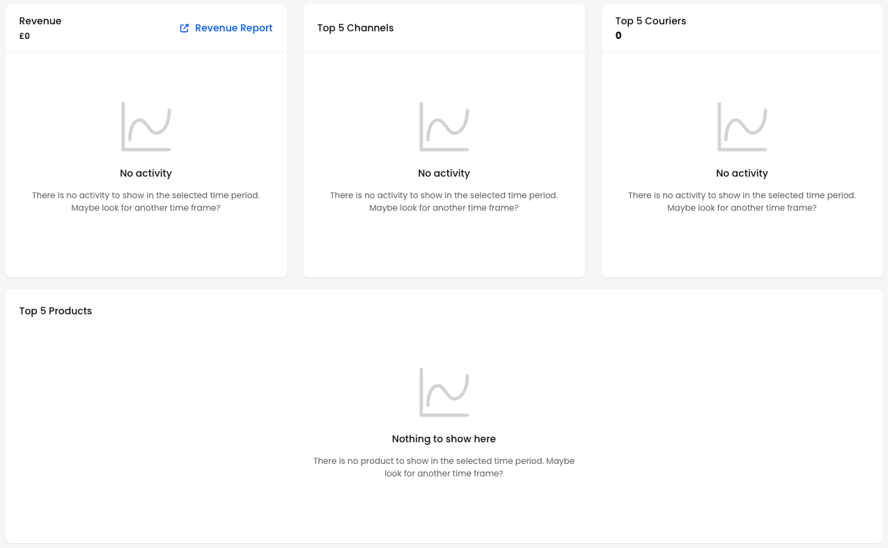
If the dashboard shows “0” for everything and the message:
“There is no activity to show in the selected time period. Maybe look for another time frame?”
Either you simply do not have data in that range yet, or your system is still being set up. Try choosing a broader or different date range to see historical activity
You can also follow the Revenue Report link to open a more detailed reporting view focused on revenue trends and breakdowns
Top 5 Channels, Couriers, and Products
Further down, the dashboard highlights your top performers in several categories:
Top 5 Channels – Your busiest sales channels (for example, web shop, marketplace integrations, or manual orders), ranked by volume or value
Top 5 Couriers – The carriers that have handled the most shipments in the selected period
Top 5 Products – The products that generated the most activity (by quantity or revenue)
When you first start using Helm, these panels may show:
“No activity… Maybe look for another time frame?” or “Nothing to show here…”
This is entirely normal for a new environment or a date range with no orders. Once you have live data flowing through, these panels become very useful for spotting patterns, such as which courier is most used or which product is driving most of your revenue

Top 5 Channels: Where Your Orders Originate
The Top 5 Channels panel in the Demo tells a very simple story:
My Store – Manual Channel
Total: £9.74K
All revenue in this period has flowed through a single channel
This makes it an ideal teaching example:
If you only see one channel here, it probably means you are either still implementing other integrations or deliberately running everything through one sales source
Once you add marketplace connections or web shops, this becomes a miniature league table of which channels are generating the most revenue
The Channel Report link takes you to a more granular breakdown, where you can:
Compare performance across channels over different periods
Identify underperforming or over‑performing channels
Export data for further analysis in your favourite spreadsheet or BI tool
Thus, the Overview tells you “My Store – Manual Channel is responsible for everything”, and the Channel Report allows you to explore “how, when and perhaps why”

Top 5 Couriers: Who Is Moving Your Parcels?
The Top 5 Couriers section in this Demo shows:
13 shipments – The Despatch Company Courier
This panel answers a deceptively simple question: which carriers are actually being used. In this case, there is a single courier handling all 13 shipments.
Once you have multiple couriers configured, this view becomes invaluable for:
Seeing which courier is most commonly selected
Checking whether you are unintentionally over‑relying on one carrier
Spotting opportunities to renegotiate rates or rebalance your shipping mix
Clicking Courier Report opens a more detailed courier‑centric report, where you can typically review shipments over time, costs and other operational details to support decision‑making and exporting for further analysis
Top 5 Products: What Is Actually Selling?
The Top 5 Products panel marries operational reality with a touch of merchandising insight. In the Demo environment you see:
Striped Silk Blouse – 2 sold – £90
White Bed Clothes – 2 sold – £90
Bedside Table – 2 sold – £130
Floral White Top – 1 sold – £25
Dark Denim Top – 1 sold – £30
This tells you that, across the selected period:
These are your best‑selling items by sales quantity
You can immediately see both volume and revenue per product
For a warehouse manager, this is wonderfully pragmatic: you know which shelves are going to be visited most often. For a commercial team, it hints at which products drive revenue and might deserve promotional attention.
Each product name is clickable in the full table, taking you into its detailed inventory record.
The Go to Inventory List link brings you to the broader inventory view, where you can:
Adjust stock levels or investigate discrepancies
Review product attributes and channel listings
Use the data as a jumping‑off point for replenishment or range planning
In short, the Overview Dashboard whispers, “These five products are leaving the building most often”; the inventory screens let you act on that knowledge
When You See “No Activity”: What To Do
If multiple areas on the Overview Dashboard show “No activity” or “Nothing to show here”, consider the following:
Check the date range in the Dashboard section and choose a period when you know you had orders
Confirm that your channels and couriers are configured and that orders are actually being imported or created
If you are still in implementation, treat this as a safe sandbox: you can use test orders to see how the dashboard reacts as data flows through
Clicking, Drilling and Downloading: From Overview to Action
The real power of the Overview Dashboard is not only that it summarises your operation; it is that several of its elements are doors into deeper analysis
In this Demo Environment you can:
Click Revenue Report to explore and export more detailed financial data
Click Channel Report to examine channel performance and tweak settings in your integrations, where applicable
Click Courier Report to review shipments by carrier and support decisions about shipping strategies
Use Go to Inventory List to pivot from “top products” into direct stock management
Meanwhile, the date range selector in the Dashboard section allows you to reframe the whole narrative: a fortnight, a month or a custom period. Choosing a different range immediately changes the counts, graphs and top‑five lists, so you can compare seasons, campaigns or implementation phases without wrestling separate reports
Summary
In short, the Overview Dashboard is designed to answer three simple questions:
What is happening right now in my warehouse?
What has been added recently?
How are we performing over time across orders, revenue, channels, couriers, and products?
As your activity grows, this page becomes the quickest way to spot trends, identify quiet periods, and confirm that all your moving parts are working together harmoniously
The Demo Environment is a carefully curated synopsis of your operation:
Live Orders tells you what is happening today
Recently Added reminds you who has just ordered
Dashboard metrics show how your chosen period is performing
Top Channels, Couriers and Products highlight where orders come from, who carries them, and which items truly earn their keep
And behind each of these panels, there is a path to a more detailed report or configuration screen, should you wish to dig deeper, export data, or fine‑tune how your warehouse and channels behave
Used well, this page becomes your daily briefing: a single, elegant vantage point from which to see, interpret and then act upon the currents of your warehouse world