Customer Care Dashboards
This is your command bridge for deliveries, exceptions and post‑purchase serenity, giving you a single vantage point from which to observe how successfully orders make their journey from warehouse shelf to delighted customer

Understanding Your Customer Care Dashboard
The Customer Care Dashboard is your command bridge for deliveries, exceptions and post‑purchase serenity, giving you a single vantage point from which to observe how successfully orders make their journey from warehouse shelf to delighted customer
Even in the demo environment, where data is intentionally sparse, the structure you see is exactly what your clients will use in their live Helm accounts to monitor delivery performance, returns and courier reliability

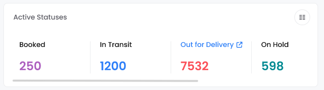
Active Statuses – A Live Pulse Of Your Deliveries
At the top of the Customer Care Dashboard you will find Active Statuses, a set of counts that describe where your open shipments currently reside in their journey
Click the View Manager button in the top‑right corner of the panel to customise what you see. From here you can activate additional statuses, arrange the columns to suit your preferences, or reset everything back to the default layout
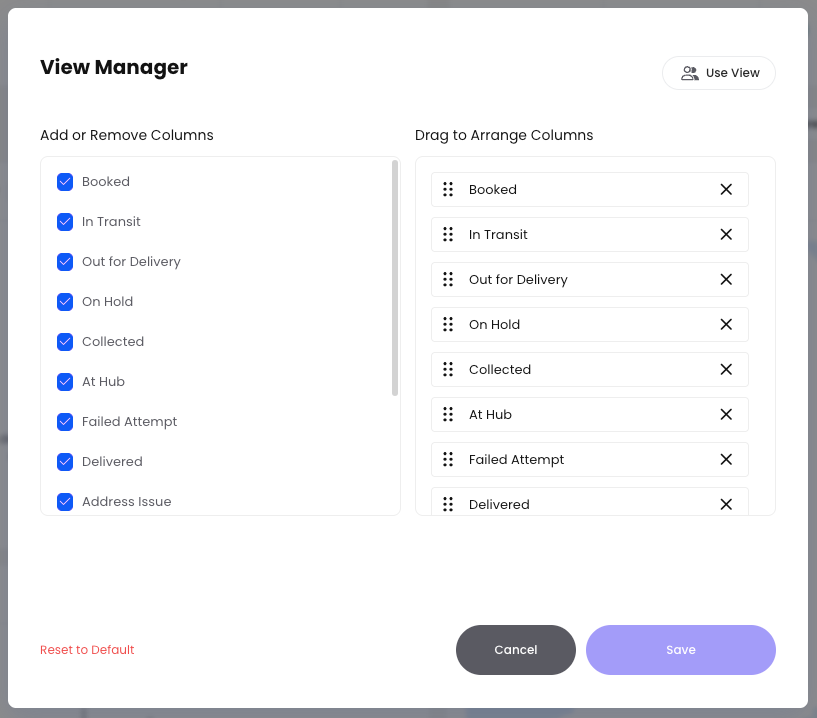
If there are more statuses than can fit on screen, simply scroll horizontally to reveal the remaining columns
Active Shipment Statuses
These statuses typically include the full journey of a parcel, from label creation to successful delivery (or trouble‑shooting along the way). Each status helps your customer care team understand where an order is, what might be delaying it, and what to say to the customer
When you click on the respected headings it will take you to the part of the system where the data came from
Booked
Orders that have been created in Helm and manifested with a courier, but are not yet in transit. At this stage a label exists and collection has usually been requested, but the parcel may still be in your warehouse waiting to be handed over. Customer care can safely say the order is prepared and awaiting collection or first scan by the courier
In Transit
Shipments that have left the warehouse and are currently moving through the courier network. This can cover line‑haul between hubs, flights, or movement between regional depots. When a shipment is in this state, support can reassure customers that the parcel is on the way, but exact delivery timing may still depend on the courier’s route and capacity
Out for Delivery
Parcels that are on the final leg with a driver en route to the customer. This is typically the status used when the van has been loaded and the driver’s route has started. Customer care can advise the recipient to expect delivery that day, usually within the courier’s standard delivery window, and to ensure someone is available at the address
On Hold
Shipments that are temporarily paused and not progressing through the network. This might be due to requested address changes, missing or incomplete information, a customer‑requested delay, a customs query, or another exception that needs human intervention. In this state, your team’s focus is to resolve the underlying issue so the parcel can move back into transit as quickly as possible
Collected
Shipments that have been physically picked up from your warehouse or consolidation point by the courier, but may not yet have received their first network scan. At this stage, the parcel has left your control and is in the courier’s custody. Customer care can confirm that the order has been collected and is awaiting its first processing event within the courier network
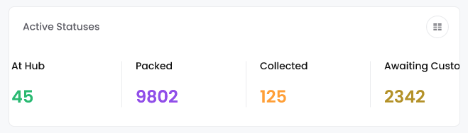
At Hub
Parcels that are currently sitting at a courier hub, depot, or sorting facility between legs of their journey. This status usually appears between In Transit and Out for Delivery as the parcel is routed through regional centres. Support teams can use this to explain that the shipment is being processed or sorted for onward movement and that minor delays can sometimes occur at busy hubs
Failed Attempt
Deliveries where the courier tried, but was unable, to complete the drop‑off. This could be due to the recipient not being at home, restricted access to the property, security issues, or other circumstances outside the courier’s control. In this state, customer care should check for any courier notes, advise the customer of the next attempt or collection option, and update any preferences (safe place, neighbour, alternative day) to increase the chance of success next time
Delivered
Shipments that have successfully reached their final destination and been confirmed as delivered by the courier, often with a scan, GPS pin, or proof of delivery image or signature. This is the happy‑path endpoint of the shipment journey. For customer care, this status is used to close the loop, handle ‘where is my order’ queries, and investigate any disputes where the customer reports non‑receipt despite a delivered scan
Address Issue
Shipments where the courier has identified a problem with the delivery address, such as missing information, an incorrect postcode, an unrecognised street, or a property that cannot be located. These shipments cannot progress until the address is clarified or corrected. Customer care’s priority here is to contact the customer or merchant, capture the correct details, update the shipment, and nudge it back into In Transit or Out for Delivery with minimal further delay
If the data of all of these values are zero
This simply means that, in this demo timeframe, there are no active shipments in any of these states
In a live environment your clients would see these numbers fluctuating through the day, providing a rapid sense of workload and risk A high number of On Hold shipments, for instance, would warrant immediate investigation, while a growing Out for Delivery count might presage a happy wave of successful completions
Delivery Performance – Outcome Of Your Shipments
Just beneath Active Statuses sits Delivery Performance, which focuses less on where parcels are and more on how their journeys are ending
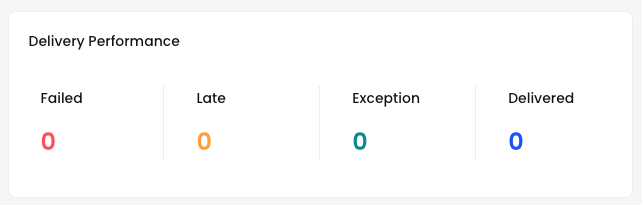
The typical outcome categories are
Failed – deliveries that could not be completed, perhaps due to an invalid address or repeated failed attempts
Late – deliveries that arrived after their expected date or service promise
Exception – shipments with special issues, such as damage, customs delays or other anomalies that require attention
Delivered – shipments that have successfully reached the customer
In the demo view each of these is currently zero
This absence of data is simply a by‑product of the demo configuration and the selected timeframe In a real account these numbers become a vital barometer of customer experience
A high Delivered count with low Failed, Late and Exception figures indicates a healthy operation, while rising exceptions could reveal systemic issues with a particular courier, region or service level
Timeframe And Comparison Context
Further down the dashboard you will see a date range such as
20 Feb – 20 Mar 2026
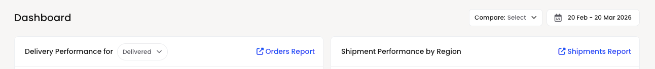
This indicates the period for which all the charts and panels on this Customer Care Dashboard are calculated Every figure, map and metric you see is constrained to this range
Alongside this sits a Compare option, allowing you to pit the current period against a previous one of equal length For example, your clients could compare the last thirty days of delivery performance against the thirty days prior, to see whether they are getting better at delighting customers or quietly drifting towards more errors and delays
In the demo environment this comparison is available but not heavily populated, since there is little real shipment activity during this period
Delivery Performance For Delivered Orders
One of the key visual panels on the Customer Care Dashboard is Delivery Performance for Delivered This chart normally shows how delivered orders have performed within the timeframe, often broken down by status, service or time‑to‑deliver
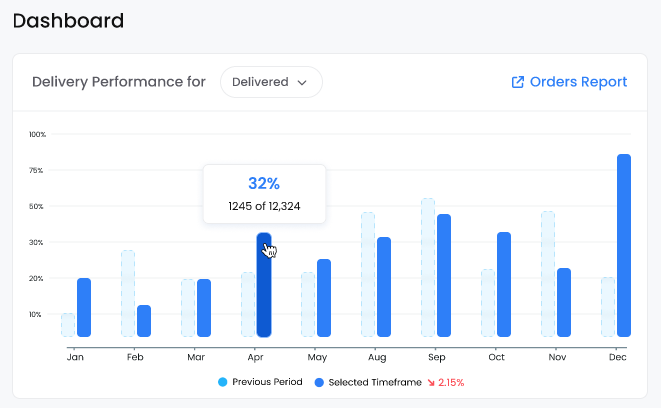
In the demo data the panel politely informs you
“Nothing to show here - There is no delivered data to show in the selected time period Maybe look for another time frame”
This means there were simply no orders that reached the Delivered state between 20 February and 20 March 2026 in this demo setup
In a live environment this chart becomes extremely informative Your clients might see
The proportion of deliveries arriving on time versus late
Trends over time, such as improving performance after changing courier services
Any spikes in failed or exception deliveries, perhaps around peak seasons or adverse weather
The link to the Orders Report allows them to jump directly into the underlying data, where they can filter by courier, service, country, or any other relevant dimension to understand the root cause of poor performance
Orders Versus Returns
Another central panel compares Orders vs Returns This is the post‑purchase yin and yang of commerce, revealing not only how many orders were sent out, but how many found their way back
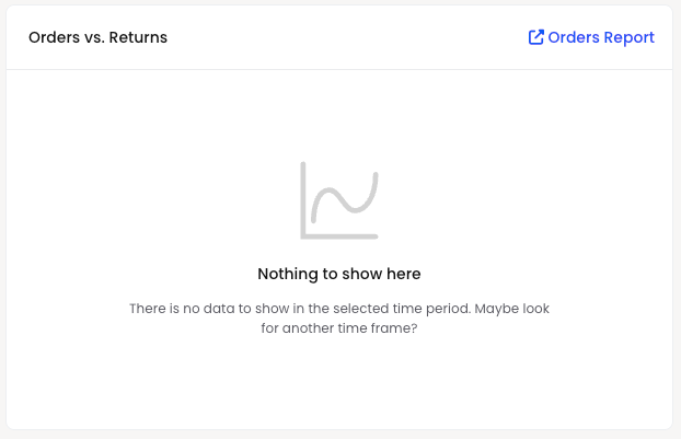
In the demo environment the panel once again announces
“Nothing to show here - There is no data to show in the selected time period Maybe look for another time frame”
This indicates that, for the chosen dates, no returns have been processed and the demo dataset has no appropriate events to chart
In a real Helm installation this visual comparison helps your clients
See what proportion of orders end up being returned
Spot problematic products, regions or time periods where return rates spike
Assess whether changes in product descriptions, sizing guidance or packaging are reducing returns over time
By following the Orders Report link they can explore the detailed record of orders and returns side by side, enabling data‑driven decisions about product quality, fit and customer expectations
Shipment Performance By Region
Further down, you will encounter Shipment Performance by Region, a map‑based view that overlays shipment outcomes onto geography
It uses a density scale built around categories such as
Very High, High, Medium, Low & Very Low
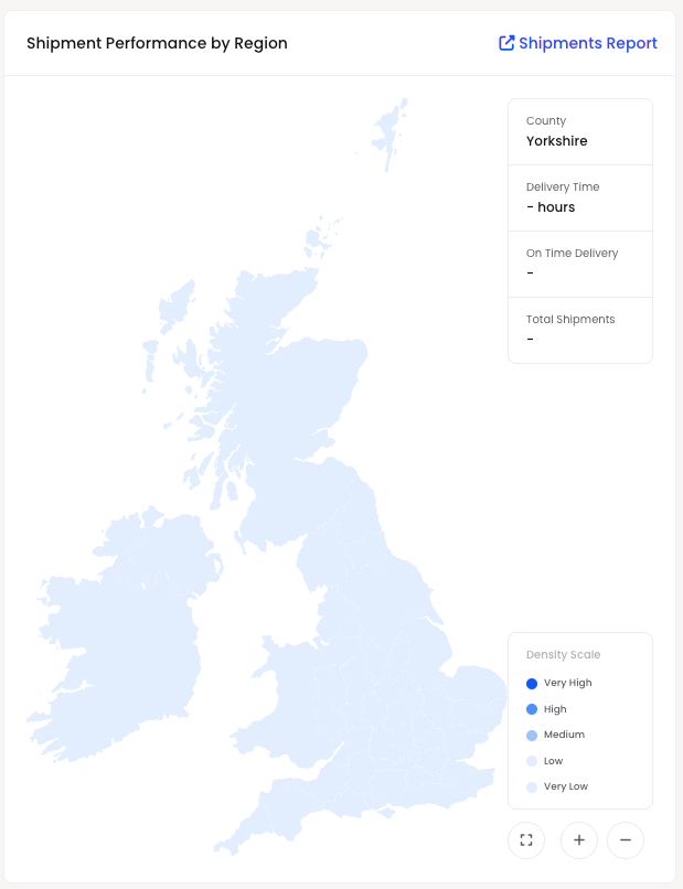
These categories describe the intensity or volume of shipment activity, often coloured to show where the greatest number of shipments are occurring or where issues cluster
In the demo snapshot you may see the map frame and a note that the zoom level has changed, but you will not see many coloured regions because the underlying data is minimal
In a live account this map becomes a powerful diagnostic instrument Your clients can
Identify hot spots where many shipments are being sent, indicating key markets
Notice regions with disproportionate levels of failed or late deliveries
Investigate whether certain countries or areas consistently experience customs delays, address issues or courier challenges
The Shipments Report link allows them to drill in, moving from a bird’s‑eye global view down to the specific shipments that underpin the patterns on the map
Delivery Performance By Courier Service
The final major panel on the Customer Care Dashboard is Delivery Performance by Courier Service This focuses on the behaviour of the carriers themselves, turning anecdotal frustrations into measurable data
The view can be toggled to focus on couriers, and is accompanied by a Couriers Report link
In the demo timeframe, once again, you will see
“Nothing to show here - There is no data to show in the selected time period Maybe look for another time frame”
This absence of demo data belies the importance of the panel in a live environment With real shipments flowing, your clients can use this section to
Compare on‑time delivery performance across different couriers and services
Identify carriers with unusually high failure or exception rates
Evaluate whether premium services are truly delivering better outcomes than economy options
Support contract negotiations with hard evidence about performance over time
By switching to couriers and opening the Couriers Report, they can zoom into the details, such as how a specific service behaves in particular countries or at different times of year
Using The Customer Care Dashboard Day To Day
Although the demo environment shows a relatively calm sea of zeros and empty panels, the structure of the Customer Care Dashboard is designed for a bustling, ever‑changing real‑world operation Once live data flows in, the dashboard becomes an early‑warning system and a celebration board in equal measure
Your clients can use it to
See at a glance how many shipments are booked, in transit, out for delivery or on hold
Monitor the balance between delivered, failed, late and exceptional shipments
Track how delivery performance changes over time, comparing periods to spot improvement or decline
Understand returns behaviour and its impact on customer satisfaction and profitability
Visualise shipment activity and issues across regions, spotting geographical patterns
Measure courier performance so they can reward excellence and challenge underperformance with confidence
In short, the Customer Care Dashboard transforms the often opaque world of shipping and delivery into a clear, navigable landscape, where data‑driven decisions can be made swiftly to protect both customer happiness and operational efficiency