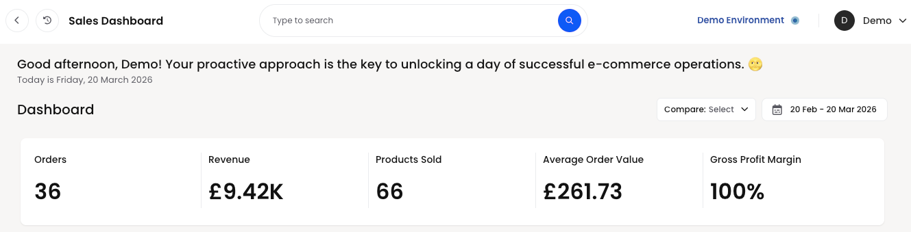
Sales Dashboard
This article walks through each section of the Sales Dashboard, explains how the demo data behaves and shows how your clients can interpret the same cards and charts in their own live Helm environment

Understanding Your Sales Dashboard
The Sales Dashboard is your commercial amphitheatre, a single stage upon which orders, revenue and profitability all perform in synchrony, allowing you to see at a glance how well your eCommerce operation is truly doing

Timeframe And Comparison
At the top of the dashboard you will see a date range selector, for example
“19 Feb – 19 Mar 2026”
This indicates the period for which all of the sales figures, charts and rankings are being calculated. Every number you see on the page relates to this selected timeframe
Alongside the date range there is a “Compare” option This allows you to compare the current period against a previous period of the same length. For instance you might compare the last 30 days against the 30 days before that, to see how your performance is trending over time
In the demo environment the focus is on 19 February to 19 March 2026, giving you a neat one‑month snapshot of sales behaviour
Headline Sales Metrics
Beneath the greeting banner you will find a set of headline metrics. These provide an immediate sense of commercial performance for the selected period
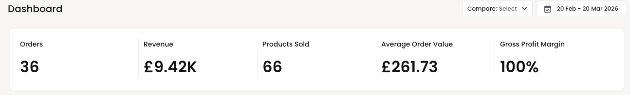
Orders
“Orders” shows the total number of customer orders created in the selected timeframe
In the demo data this is Orders: 36
If this were your live account this would represent 36 distinct sales orders received across all connected channels during the chosen period A rising order count suggests increasing demand, while a falling count may prompt you to review pricing, marketing or product availability
Revenue
“Revenue” shows the total sales value of those orders for the timeframe
In the demo data this appears as Revenue: £9.42K
This means that the combined value of all 36 orders is £9,420 in the selected period In your own account this metric answers the most fundamental question of all – how much money did we take in sales
Products Sold
“Products Sold” represents the total quantity of individual items sold, across all orders and channels, during the period
In the demo data this is Products Sold: 66
This means that although there were 36 orders, some orders contained multiple items, giving a total of 66 units sold If you notice revenue increasing faster than products sold, it may indicate higher pricing or a richer product mix; if products sold rise but revenue does not, it might suggest discounting or a shift to lower‑value items
Average Order Value
“Average Order Value” (often abbreviated to AOV) shows the mean revenue per order for the period It is calculated simply as total revenue divided by the number of orders
In the demo dataset we see Average Order Value: £261.73
This tells you that, on average, each of the 36 orders in the period brought in approximately £262 In a live environment, you might seek to increase this number through up‑selling, bundles or minimum free‑shipping thresholds, as higher AOV can significantly improve profitability
Gross Profit Margin
“Gross Profit Margin” expresses, as a percentage, how much profit you retain after product costs are deducted, before overheads and operating expenses It is calculated from the relationship between revenue and cost of goods sold
In the demo data this is shown as Gross Profit Margin: 100%
This is deliberately exaggerated for demonstration purposes It indicates that in this demo configuration the system has no cost prices set for the products, so all revenue is treated as gross profit In a live system you would normally see a far lower, more realistic percentage, for example 30%, 45% or 60%
In your own account this metric is extremely valuable It reveals whether you are selling enough high‑margin products and whether discounting, shipping costs or supplier prices are eroding your profitability
Revenue Over Time
The “Revenue Over Time” chart visualises how your revenue and gross profit margin evolve day by day during the selected period It helps you see patterns rather than just a single total
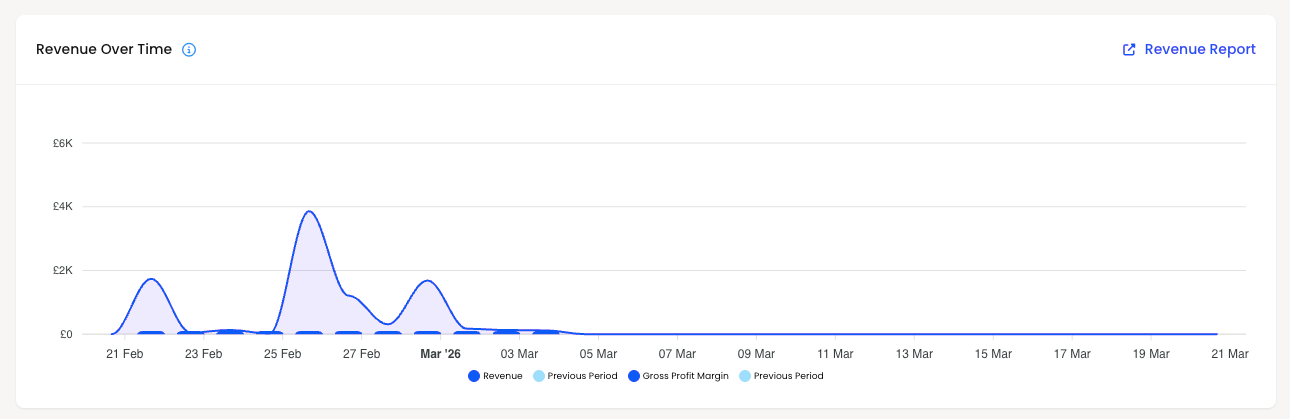
The chart presents
A line for “Revenue” per day
A line or markers for “Gross Profit Margin” over time
Optional comparison lines for the “Previous Period”
In the demo data you will see a chart with dates along the horizontal axis from 20 February to 20 March and revenue values on the vertical axis However the summary underneath currently displays the Revenue & Gross Profit Margins = £0
This simply reflects that, for demonstration purposes, the detailed graph is not actively plotting values despite the headline cards showing aggregated numbers When connected to your real data, you would see each day’s revenue rising and falling, with the ability to visually compare this to the previous period’s performance
You can use this chart to
Identify peak sales days, such as marketing campaigns or seasonal events
Spot quieter intervals where additional promotion may be needed
Compare current performance with previous periods to see whether you are improving, declining or remaining stable
For More Elaborate Reports
To generate more detailed reports, Choose between Order Summary and Order Items:
Order Summary:
This report gives a high‑level view of orders over a selected period. It typically includes totals like number of orders, total revenue, average order value, and order status breakdowns (dispatched, pending, cancelled, returned). It’s ideal for quick trading snapshots and management reporting without diving into line‑item detail.
Cancelled orders
This focuses specifically on orders that were cancelled within the chosen date range. It normally shows when the order was placed, when it was cancelled, the cancellation reason (where available), order value, and channel. It’s useful for spotting trends like high cancellation rates from a particular marketplace, product, or time period so you can address stock, pricing, or service issues.Not dispatched on time
This report highlights orders that missed their expected dispatch SLA. You’ll usually see order reference, channel, promised dispatch‑by date, actual dispatch date (or “not yet dispatched”), and how late the order is. It’s designed for operational follow‑up and for improving carrier cut‑offs, staffing levels, or process bottlenecks that cause late shipments.Biggest spenders
This report identifies your highest‑value customers over a chosen period. It aggregates spend by customer, showing metrics like total revenue, number of orders, average basket size, and last order date. It’s ideal for CRM and marketing teams who want to target VIP customers with loyalty campaigns, special offers, or priority service.Custom order summary report
This option lets you generate a tailored version of the Order Summary. Typically, you can choose your own filters (channel, warehouse, status, date range) and select which fields and groupings you want (for example, summary by marketplace, by shipping method, or by country). It’s useful when standard summaries don’t quite match what finance, ops, or management want to see in their weekly or monthly packs.
Order Items:
This report unfurls every order into its constituent line items, presenting one row per product rather than one row per order. It typically includes SKU, product name, ordered quantity, unit price, line value and order identifiers. Use this when you wish to scrutinise what is actually moving through the warehouse, identify high‑volume SKUs and understand operational workload at the pick‑face
Order items report
This is usually a more formal, tabular, export‑friendly rendition of the Order Items data, optimised for sharing with finance, operations or BI tools. Expect consistent column structures, filters for dates, channels and warehouses, and fields laid out specifically for reconciliation, performance analysis and external reporting. In essence, it is the canonical “hand this to someone important” version of the raw item dataCost of goods
This report marries your order items with their associated cost prices to provide a view of cost of goods sold. You will typically see quantity, cost per unit, total cost value and sometimes a gross margin indication per line or per SKU. It is indispensable for teams wishing to move beyond “top‑line revenue” and into the more sobering realm of profitability and product‑level performanceReturned items
This report isolates items that have been returned after dispatch, detailing what came back, in what quantity, and often why. Expect SKU, product name, return quantity, return reason and associated order references. It is particularly valuable for spotting problematic products, packaging issues or expectation mismatches that are driving return rates and eroding customer delightRefunded items
While Returned Items focus on physical stock coming back, Refunded Items centre on the financial reversals. This report shows which items have had their value refunded, the amounts involved, and where available, the reason for the refund. It is useful for finance and customer service to monitor goodwill gestures, dispute resolutions and any products or channels that are disproportionately driving lost revenueBack order report
This report shines a merciless spotlight on items that have been ordered but are not yet available to fulfil, typically because stock is awaiting replenishment. You will usually see SKU, product description, outstanding quantity, associated orders and sometimes expected replenishment dates. Operations and purchasing teams can use this to prioritise inbound stock, manage customer expectations and avoid the unseemly chaos of persistent oversellingCustom order items report
This option allows you to concoct a bespoke version of the Order Items data set, selecting precisely which fields, filters and groupings you require. For example, you might build a report filtered to a single marketplace, grouped by brand and limited to items above a certain order volume. It is perfect when standard item‑level views are almost, but not quite, what your finance, analytics or operations stakeholders have demanded in their latest baroque reporting request
Sales By Channel
The “Sales by Channel” section breaks down your revenue by sales channel, helping you understand which sources of orders are truly driving your business forward
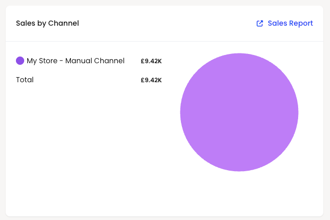
In the demo data the table shows
My Store – Manual Channel: £9.42K,
Total: £9.42K
This tells you that, in the demo period, all revenue has been attributed to a single channel called “My Store – Manual Channel” The “Total” confirms that this adds up to the same £9.42K you see in the headline revenue card
In a real Helm installation you might see multiple channels here, for example
Your main eCommerce website
Marketplaces such as Amazon or eBay
Manual or phone orders
Additional web shops or regional storefronts
This section allows you to
See which channels are contributing the most revenue
Identify underperforming channels that may need optimisation
Evaluate the impact of new channels you have recently launched
You can click the linked “Sales Report” to drill into more detailed channel‑level reporting for the same period
Click on Sales Report Top right generate detailed reports- Reports
Sales By Country
The “Sales by Country” panel shows where your customers are located, again for the selected timeframe The total revenue is broken down by country, allowing you to visualise your geographic spread
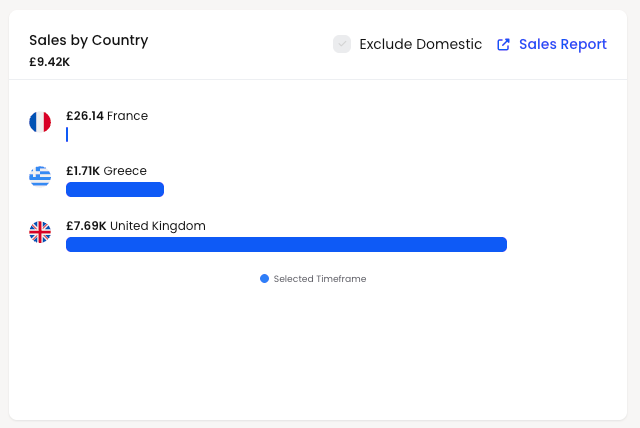
In the demo environment the panel shows a total of £9.42K, then lists
France – £26.14
Greece – £1.71K
United Kingdom – £7.69K
These three amounts collectively contribute to the overall revenue in the period, with the United Kingdom clearly dominating in this scenario
There is also an “Exclude Domestic” toggle which allows you to remove your home country from the chart and focus purely on export or international sales This is especially useful if your domestic market is very large, as it allows you to see more subtle growth in overseas regions without the home country overshadowing the graph
In a live account this section helps you
Understand which countries or regions are most lucrative
Identify emerging markets where small but growing revenue streams appear
Inform decisions on localisation, currency support, shipping services and tax registrations
You can again click through to the underlying Sales Report for deeper geographical analysis
Click on Sales Report Top right generate detailed reports- Reports
Top 10 Products Revenue
At the foot of the Sales Dashboard you will find the “Top 10 Products Revenue” table This is where we move from high‑level metrics into the realm of individual product heroes and supporting cast
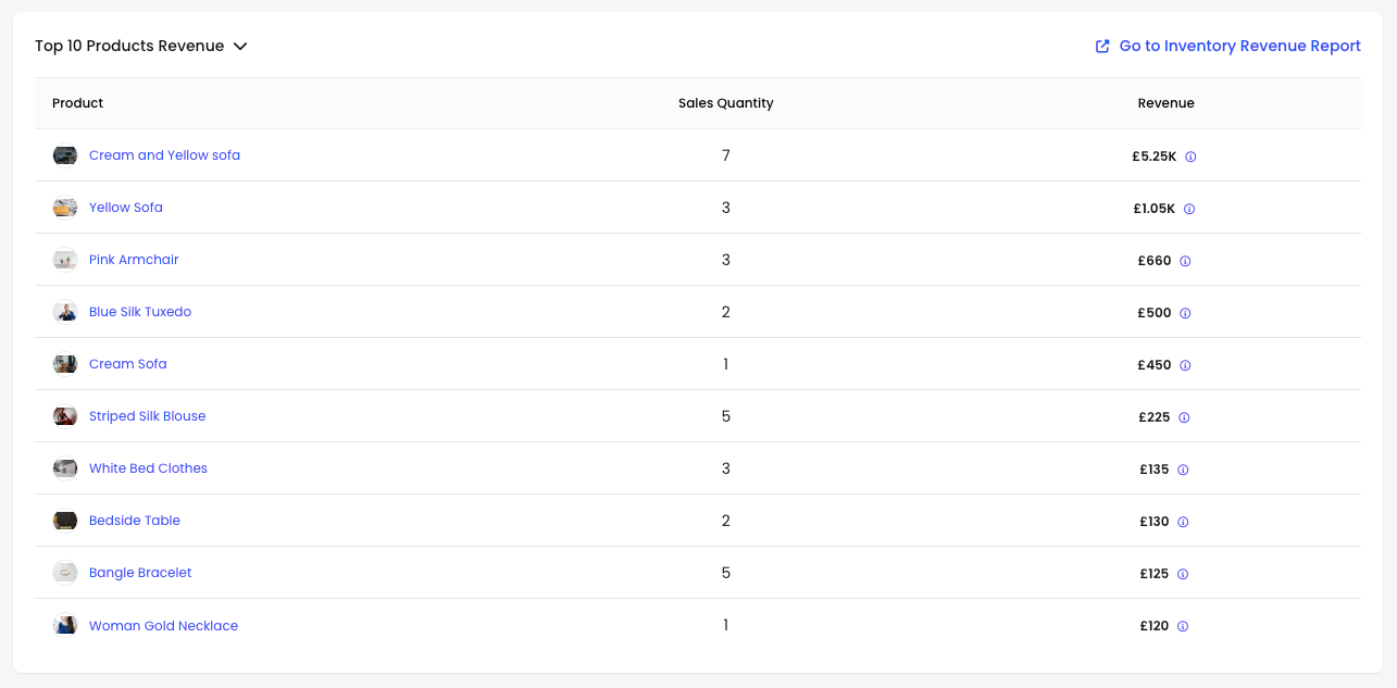
The table shows, for the selected timeframe
Product name
Sales Quantity
Revenue generated
In the demo data the table is populated as follows
Cream and Yellow sofa – 7 units – £5.25K
Yellow Sofa – 3 units – £1.05K
Pink Armchair – 3 units – £660
Blue Silk Tuxedo – 2 units – £500
Cream Sofa – 1 unit – £450
Striped Silk Blouse – 5 units – £225
White Bed Clothes – 3 units – £135
Bedside Table – 2 units – £130
Bangle Bracelet – 5 units – £125
Woman Gold Necklace – 1 unit – £120
From this alone you can deduce several useful insights even in the demo environment
The “Cream and Yellow sofa” is your undisputed revenue champion, generating £5,250 from just seven units, making it both high value and reasonably popular The “Yellow Sofa” and “Cream Sofa” also feature strongly, suggesting that sofas in general are the backbone of this fictional business
Meanwhile, items like “Bangle Bracelet” and “Striped Silk Blouse” have lower revenue individually but appear in higher quantities, which in a real operation might indicate impulse or add‑on purchases that lift your average order value
In your own account your clients can use this section to
Identify their best‑selling products by revenue, not just by quantity
Spot high‑margin or high‑value items that warrant extra promotion or stock protection
Recognise under‑performing products that rarely make the top ten and may need to be discounted, re‑positioned or retired
Each product name is clickable, taking the user to the relevant product detail or inventory revenue report, allowing them to explore margin, stock and sales performance in much greater depth
Click on Inventory Revenue Report Top right generate detailed reports - Reports
Using The Sales Dashboard In Day‑To‑Day Trade
Although the demo environment uses charming sofas and sartorial delights to demonstrate the concept, the structure exactly mirrors what your clients will see in Helm with their own catalogue and orders
Once connected to their stores and channels, the Sales Dashboard becomes a daily command centre
They can
Glance at orders, revenue, products sold and gross profit margin for the current period
Analyse sales patterns by day through the Revenue Over Time chart
Understand which channels and countries are doing the heavy lifting
Discover which products are truly driving revenue and which are merely loitering in the catalogue
Taken together, these metrics transform the Sales Dashboard from a simple collection of numbers into a sophisticated decision‑making instrument, guiding smarter merchandising, more intelligent marketing and more profitable stock management